Remaking Brutalist Buildings
Remaking Brutalist Buildings — It Can Be Done!
by Nick Hodges, AIA
When I joined Hacker 20 years ago, I never imagined we would become experts in transforming Brutalist buildings dating to the 1960s. In recent years, however, renewing these formidable concrete structures has become a sweet spot of our practice—a challenging mix of sustainable, renewal, and creative problem solving that hinges on the power of collaborative, holistic design.
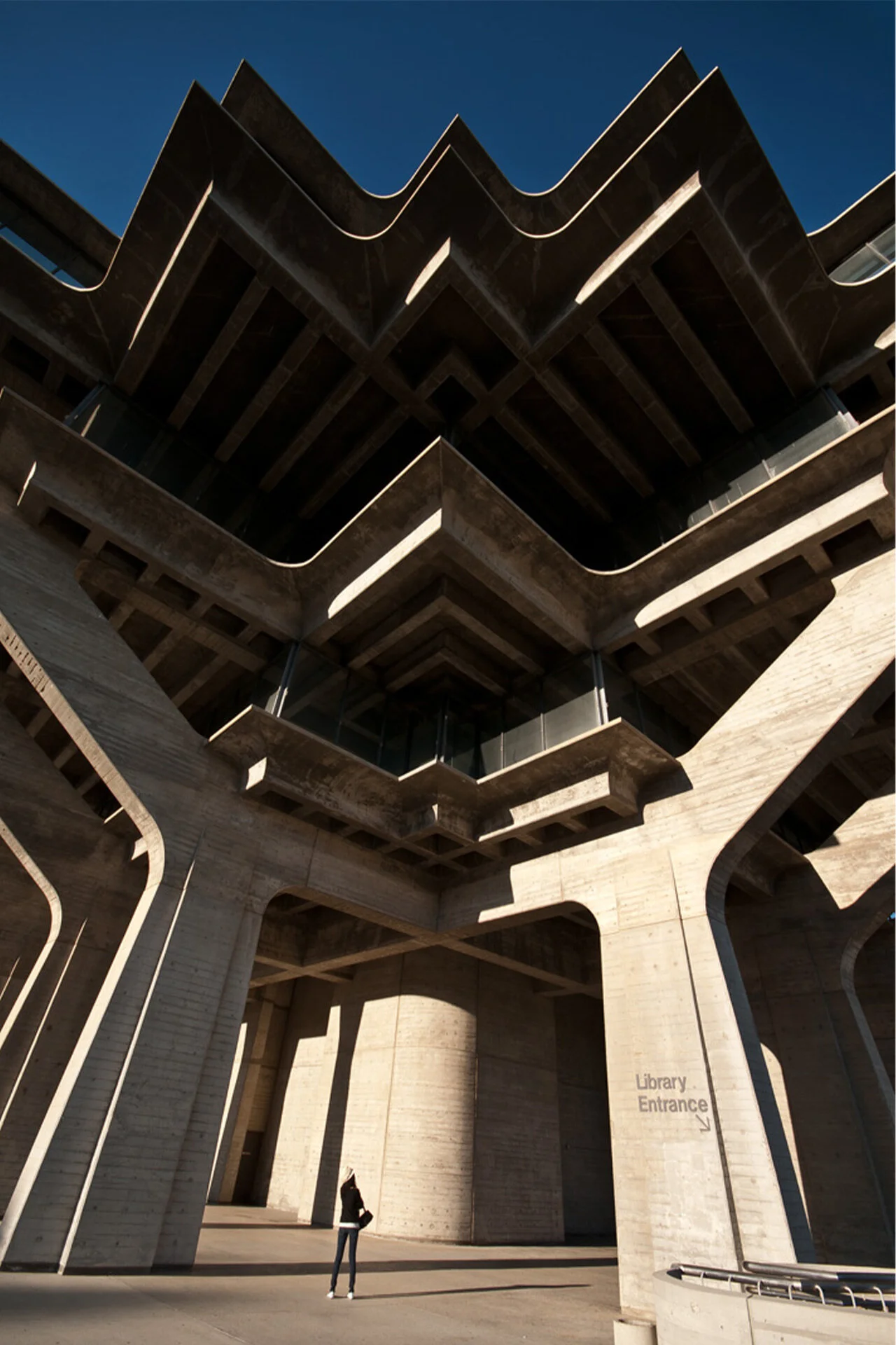
In the United States, the widespread embrace of Brutalist architecture was a reaction to events of the time. Amidst an institutional building boom and a decade of social upheaval, the monolithic, fortified nature of Brutalism had a pragmatic appeal for growing colleges, universities, and cities.
A half-a-century later, these defensive and inwardly focused buildings represent the antithesis of the open, flexible environments we design today. As these buildings near the end of their first life cycles, these concrete behemoths pose significant challenges for their institutional and government owners. While sustainability and lean budgets argue for renovation rather than replacement, reimagining these libraries, government halls, classroom buildings, and other facilities for the next 50 years can make the task daunting.
Despite their concrete construction, buildings from this era are generally not to current structural codes and are burdened with years of deferred maintenance exacerbated by the 2008 financial crisis—an economic event from which many colleges and universities never fully recovered. Tackling these fundamental updates and repairs is costly, and often there is not much money left for the changes that enhance the building’s user experience; however, by holistically looking at the challenges and opportunities, we have developed a strategy for accomplishing much more.
Our recent experience transforming buildings of this era and type is significant. The following three Hacker projects showcasing Brutalist building repositions:
Fariborz Maseeh Hall at Portland State University (dating the 1960s)
Salem Public Library (dating 1972)
Health Technology STEM at Portland Community College (dating 1968)
These projects highlight three key tactics the Hacker design team applies to make the most of deferred maintenance budgets when repositioning Brutalist structures for the future:
• Center the design process on the user — the community members, students, or others the building will serve.
• Establish a menu of opportunities prioritizing once-in-a-life-cycle, transformative changes to a building.
• Engage with owners, contractors, consultants, and subcontractors in collaborative, fine-grained decision-making that keeps design opportunities on the table for as long as possible.
Portland State University, Fariborz Maseeh Hall
LOCATION: Portland, Oregon
SIZE: 220,000 SF
TYPE: Renovation
COMPLETED: 2019
DELIVERY TYPE: CMGC
Fariborz Maseeh Hall serves nearly all Portland State University (PSU) students. The directive from PSU was to transform the fortress-like 1960s brutalist building into a modern, interactive, light-filled academic hub.
The design improves connectivity, wayfinding, and accessibility and brings the building into life safety compliance, while strengthening the connection between the university and the city.
Constructed in two phases and architectural styles, the goal to remake the hall into a modern, uplifting campus hub connected to the city faced significant hurdles—specifically, a limited budget intended primarily for deferred maintenance and life-safety improvements without any recognition of the building's program inefficiencies and inability to meet today and future pedagogical needs.
There was a lot to address: a failed facade, outdated MEP systems, and confusing wayfinding, a result of the absence of a unifying vision for the two halves of the building. In our favor, the team (owner, architect, contractor) embraced principles of design/build, in particular target value design and life cycle costing, to remake Fariborz Maseeh Hall for the next 50 years.
Fariborz Maseeh Hall, PSU
A desire driven to create an engaging, open, and humane experience, the design emphasizes access to daylight and connections between indoor and outdoor spaces, connecting the active thoroughfare and park settings on this urban campus.
With surgical precision, the team evaluated MEP systems and existing spaces, replacing or improving critical items and scheduling others for the future. The savings allowed for "the big move": a light-filled central atrium and lounge that makes the heart of the building a place of social connection and physical orientation. Once buried within the building, Student Services now faces the adjacent city park, welcoming students with a contemporary lobby.
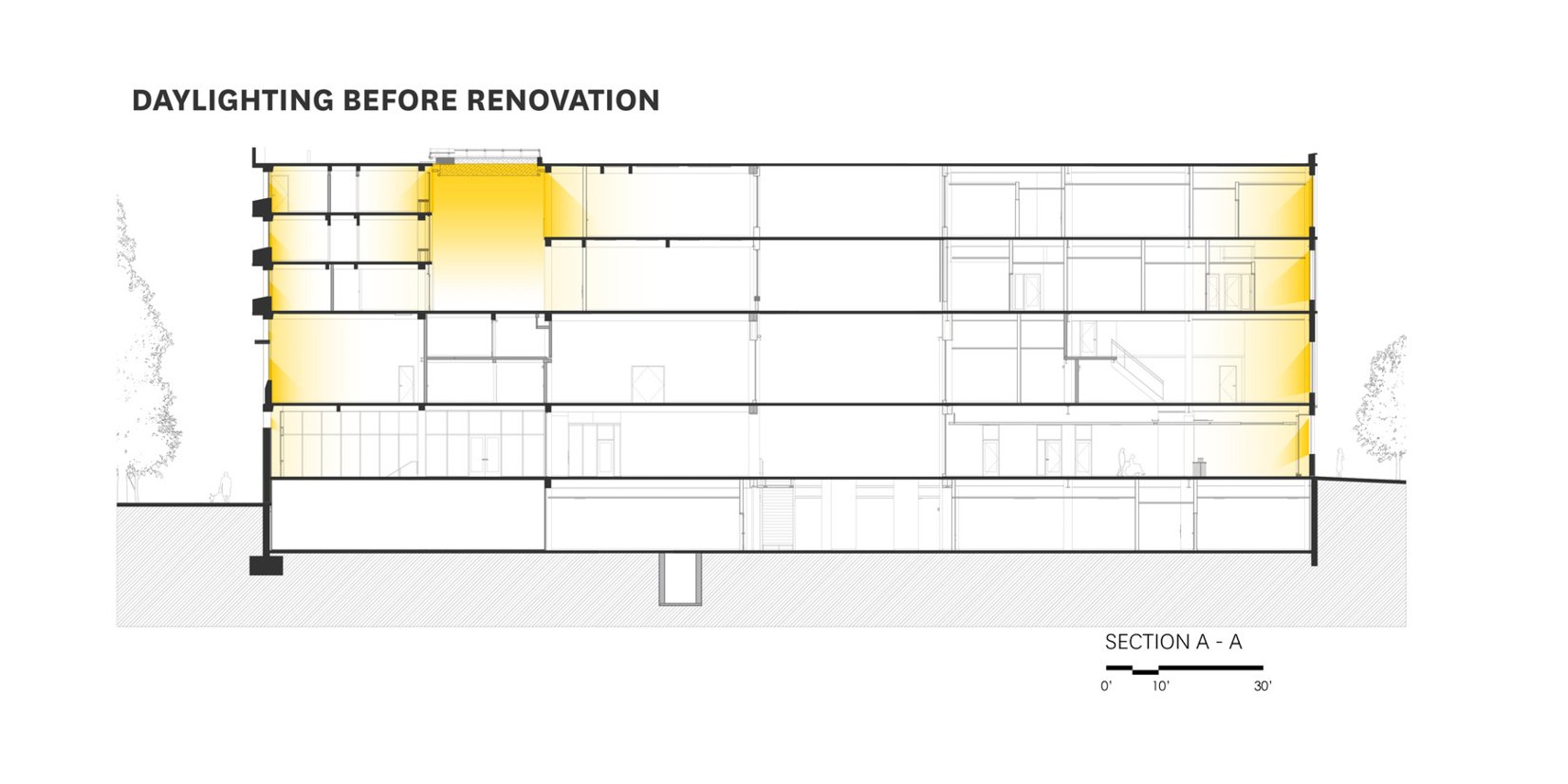
A new central lightwell brings daylight into the heart of this dense building, and a more transparent facade provides visual connectivity to the outdoors.
Through a rigorous programming exercise, the team removed 20,000 sf floor area for the lightwell reducing only 3,000 sf of assignable space while improving program efficiency and flexibility with the additional floor area at the interior with access to daylight.
The new atrium, lightwell, and resulting building planning makes the building easier to navigate for increased wayfinding.
New Atrium, Fariborz Maseeh Hall, PSU
New Central Lightwell, Fariborz Maseeh Hall, PSU
Classroom View into Atrium, Fariborz Maseeh Hall, PSU
(Before Construction) Classroom
Replacing the International Style facade of the 1961 half of the building was essential to address its failing performance but also to open views towards the park. For the concrete and brick Brutalist side of the building, completed in 1969, we took a lighter approach, replacing concrete panels with picture windows, reconfiguring an accessible entry, and, with philanthropic support, adding the Jordan Schnitzer Museum of Art.
Improved ground floor program distribution provides visual and physical connections between the plaza and park amenity spaces, expanding opportunities for increased student activity and interaction outside the classroom.
The extent of the 1961 west building curtainwall system was beyond its usable life and was removed entirely. In place of the failing curtainwall is a new externally insulated assembly with metal cladding and high-performing windows.
Previously closed-in hallways and circulations now have unobstructed sightlines between the building's eastern and western perimeter.
Strategically located elevators allow accessibility to all levels of the building, which were not previously connected.
Replaced the International Style facade of the 1961 half of the building.
Improved Ground Floor, Fariborz Maseeh Hall, PSU
(Before Construction) Ground Floor
Salem Public Library, City of Salem
LOCATION: Salem, Oregon
SIZE: 96,000 SF
TYPE: Renovation
COMPLETED: 2021
DELIVERY TYPE: Progressive Design-Build
When funding came through for the Salem Public Library for a seismic renovation, they saw a rare chance to address some of the additional challenges encountered by staff and library patrons in their aging concrete building and outdated spaces.
Completed in 1972, this introverted and bunker-like three-story main library is emblematic of its era. While the impetus for the renovation was a 2017 bond measure for seismic and safety improvements, the building had more complex issues. After a 1990s expansion, which included an auditorium and parking garage, most patrons began arriving through the rear of the library, upending the logic of the original entry sequence. The original stairs, oriented towards the main entry, became hard to find, and an addition within the library’s double-height central space loomed overhead.
Each design aspect is filtered through a practical lens of how each choice can improve seismic and life safety while creating a greater sense of order in the program of the building. Early concept design options became possible after the price of the critical seismic improvements came in more economically than predicted.
Salem Public Library, City of Salem
The engagement process with the library staff and community established a mission to create a welcoming, safe, and flexible space focused on enriching connections to people and nature.
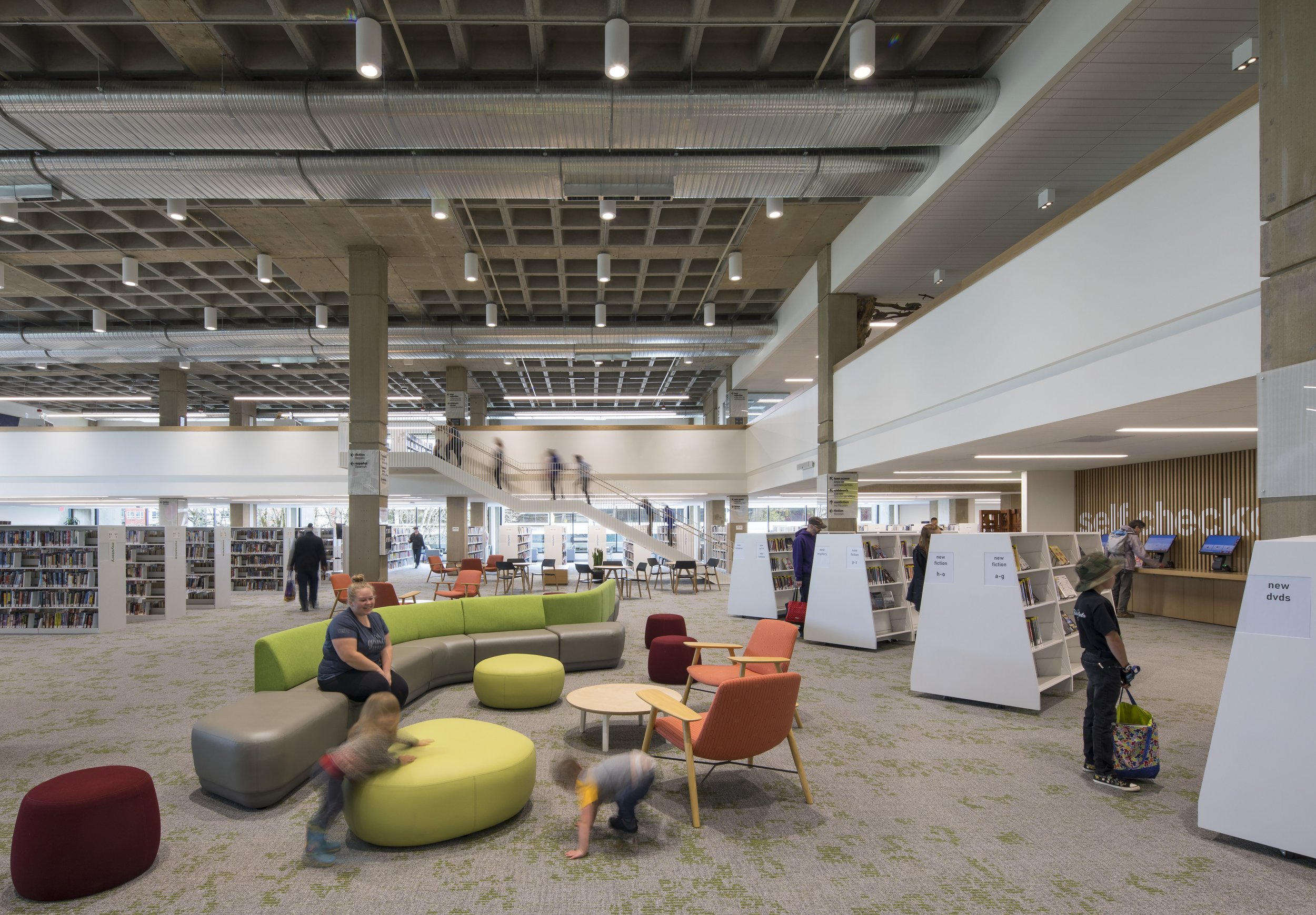
We looked at all opportunities to minimize costs, such as exposing the beautiful waffle-tile slab ceiling (rather than replacing the deteriorating ceiling tile). Seismic strengthening was a key driver for the project. Once our team established the feasibility of a less costly shear-wall design, we had more resources to allocate to other improvements, which we developed as a series of options with associated costs.
Replace the west-facing concrete walls with large bay windows to open a visual connection between library patrons and the nearby neighborhood to bring in more daylight.
A relocated, highly visible central staircase creates clear wayfinding between the two-public levels.
The design transforms an inward-facing, brutalist-era building into a bright, voluminous space inviting daylight and community into its core.
Presenting improvements as discrete, independent options with associated prices gave the design-build team, city project administrators, and the library clear targets to strive for.
Main Level 2, Salem Public Library
(Before Construction) Main Level 2
(During Construction) Main Level 2
Bay Windows, Salem Public Library
(Before Construction) Bay Windows
(Before Construction) Bay Windows
Engagement with library staff and community highlighted a need to reorganize private and public library spaces. To create a supportive and cohesive library experience, the design reimagines how multi-functional spaces relate to one another. Private staff spaces, public community spaces, reading spaces serving different aged groups, quiet zones, noisy zones, and high-traffic areas are some of the design’s considerations.
Originally, public entered at the lowest level of three from the civic plaza. With the 1990 expansion, the back door of the library on the second level became the primary entrance from the garage. The new design establishes this second level entrance as primary with clear sight lines across the building.
Shifting the public entrance to level two allowed for a shift in library staff spaces, once separated into multiple levels, now consolidate to the lower level for increased internal process efficiency and functionality.
Youth spaces previously separated across several floors now share the top level overlooking the main reading room. The youth spaces are now visually connected while being acoustically separated.
The second-level plaza houses the main public entrance from the garage, which opens to an active, bustling lobby and adult section adjacent to makers space for hands-on learning, meeting and conference space, and a community room that can accommodate large events.
Main Entry from Garage, Salem Public Library
Health Technology STEM, Portland Community College - Sylvania
LOCATION: Portland, Oregon
SIZE: 127,000 SF
TYPE: Renovation
COMPLETED: 2023
DELIVERY TYPE: CMGC
Portland Community College’s first campus design project to incorporate Critical Race Theory into an intensive thorough student engagement process.
Transform a bunker-like mid-century health technology building to support 21st century learning with a focus on STEM science, with overhauls to learning labs and science classrooms. Portland Community College’s (PCC) first campus design project to incorporate Critical Race Theory into an intensive, thorough student engagement process.
One of a collection of Portland Community College’s first buildings, our approach looks for solutions that can be applied holistically across the entire campus and charts a course for updating and repositioning the low-slung Brutalist buildings completed in 1968. With their deep overhangs and low ceiling heights, these concrete buildings are especially difficult to reposition with the daylight, flexibility, and other qualities we now value in learning environments. The Health Technology Building, the first renovation to move forward, will set a baseline for future projects and inform supporting bond measures.
Atrium, Health Technology, PCC Sylvania
Portland Community College (PCC), Sylvania Health Tech building is a complete renovation of a brutalist-era concrete bunker-like building comprised primarily of health and science learning environments. The design brings daylight to the center of the building by cutting and creating a multiple-level atrium, providing visual connections across levels while maintaining acoustic separation where needed.
Together with a client group and project team committed to a student-centered approach focused on investments with the greatest impact, we were able to evaluate every aspect of the building (structure, building systems, enclosures, etc.) with an eye towards the next 50 years of use.
The reconfigured floor plan centers around a renovated atrium, the new social hub.
A clear priority for PCC is to expand and modernize pedagogical spaces. We are able to accomplish this while introducing informal collaborative nodes in the open-air hallways encircling the atrium. The result is a more cohesive and uplifting experience for students where learning and support extends beyond the classrooms—and success is bolstered by a strength identity for Health Technology programs overall.
Atrium Stairs, Health Technology, PCC Sylvania
(Before Construction) Atrium Stairs
(During Construction) Atrium Stairs
The original mid-century building far outdated modern higher academic pedagogy creating an anti-social, outward facing environment that required students and staff to arrive and depart from the perimeter of the building. Students and staff often spent as little time as possible in the building. Challenges were also faced by facilities with regards to maintenance and security.
The goal for reimagining the Health Technology building was to give the building a heart, bringing staff and students into its center with opportunities to cross paths, pause, and nurture their academic and social connections.
The design inverts the building, pulling occupants into a welcoming and easy to navigate layout.
The more efficient building organization consolidates general purpose classrooms to one level and creates places at the center for students to wait for class.
Replacing outside walls with glass and windows increases access to daylight, making it possible to see activity inside as well as nature outside.
PCC is known for their commitment to broad stakeholder and user engagement, and focus on elevating the voices of their BIPOC staff and students. Hacker trained with PCC on Critical Race Theory in an effort to rethink traditional assumptions around design and engagement of marginalized users.
Atrium, Health Technology, PCC Sylvania
(Before Construction) Atrium


